Theme 🎨
The Theme folder, at the root of project, includes a nice kit for building and maintaining the UI of application. It helps with variables and reusable classes to create harmony between application screens.
How to use ❓
The boilerplate provides a custom hook called useTheme and you can use it like the example bellow:
Variables
The first file is the variables one. It contains 3 groups of variables :
🎨 Colors : defines global colors of the graphical charter,
export const Colors = {transparent: 'rgba(0,0,0,0)',inputBackground: '#FFFFFF',white: '#ffffff',text: '#212529',primary: '#E14032',success: '#28a745',error: '#dc3545',}🎨 NavigationColors : defines global colors of the react navigation theme,
export const NavigationColors = {primary: Colors.primary, // The primary color of the app used to tint various elements. Usually you'll want to use your brand color for this.// background: '', The color of various backgrounds, such as background color for the screens// card: '', The background color of card-like elements, such as headers, tab bars etc.// text: '', The text color of various elements// border: '', The color of borders, e.g. header border, tab bar border etc// notification: '', The color of Tab Navigator badge}🔠 FontSize : defines sizes for your text guidelines. These variables are used in the file Font described down below.
export const FontSize = {small: 12,regular: 14,large: 18,}✂️ MetricsSizes : defines metrics sizes of your guidelines. These variables are used by Gutters to create generic spaces for all your application,
const tiny = 5 // 10const small = tiny * 2 // 10const regular = tiny * 3 // 15const large = regular * 2 // 30export const MetricsSizes = {tiny,small,regular,large,}
Common
The Common defines global style. It helps keeping the style at one place and avoid stylesheets everywhere in the code.
For example you can defines style for buttons, inputs, background like this :
Font 🔤
The Font presets some text classes using the FontSize variables.
It provides these classes:
textSmall
It applies a fontSize: FontSize.small on the element and apply the text color
textRegular
It applies a fontSize: FontSize.regular on the element and apply the text color
textLarge
It applies a fontSize: FontSize.large on the element and apply the text color
titleSmall
It applies a fontSize: FontSize.small * 2, fontWeight: 'bold' on the element and apply the text color
titleRegular
It applies a fontSize: FontSize.regular * 2, fontWeight: 'bold' on the element and apply the text color
titleLarge
It applies a fontSize: FontSize.large * 2, fontWeight: 'bold' on the element and apply the text color
textCenter
Centers a text horizontally.
textJustify
Justifies a paragraph.
textLeft
Aligns text on the left side of his parent.
textRight
Align text on the right side of his parent.
Gutters ✂️
Gutters is a classes generator. It builds from MetricsSizes variables all associated gutters. It generates, for each MetricsSize variables, classes like this :
Where :
[size]: is the key of the variable included in MetricsSizes ('small' for example)[direction]: can be ['Bottom','Top','Right','Left','Horizontal','Vertical'][op]: can be ['Margin', 'Padding'][value]: is the value of the [size]
For example, for the metricsSize small, the Gutters file provides these classes :
and
Images 🖼
This files includes all images used in the application. To use it, you only have to import the image like below
Then you can use your image like this :
Layout
The Layout file gives basic stylesheets classes to create layout and align elements.
Column layout ⬇️
All stylesheet classes below help building a Column layout
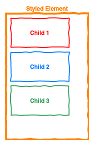
column
Apply a top to bottom direction's column to an element. So all direct children will be stacked as following:
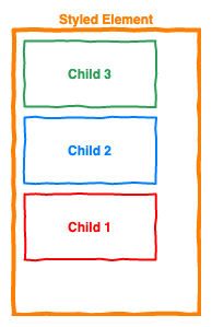
columnReverse
Apply a bottom to top direction's column to an element. So all direct children will be stacked as following:
colCenter
Apply a top to bottom direction's column and center all direct children as following:
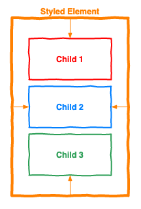
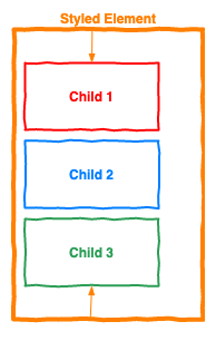
colVCenter
Apply a top to bottom direction's column and center vertically all direct children as following:
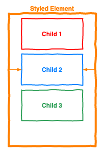
colHCenter
Apply a top to bottom direction's column and center horizontally all direct children as following:
Row layout ➡️
All stylesheet classes below help building a Row layout
row
Apply the row direction to an element left to right. So all direct children will be stacked as following:
rowReverse
Apply the column direction to an element right to left. So all direct children will be stacked as following:
rowCenter
Apply the column direction to an element left to right. So all direct children will be stacked as following:
rowVCenter
Apply the column direction to an element left to right. So all direct children will be stacked as following:
rowHCenter
Apply the column direction to an element left to right. So all direct children will be stacked as following:
Default layout 🃏
center
center horizontally and vertically an element
alignItemsCenter
Align children of a container in the center of the container's cross axis.
alignItemsStart
Align children of a container to the start of the container's cross axis.
alignItemsStretch
Stretch children of a container to match the height of the container's cross axis.
justifyContentCenter
Align children of a container in the center of the container's main axis.
justifyContentAround
Evenly space off children across the container's main axis, distributing the remaining space around the children. Compared to space-between, using space-around will result in space being distributed to the beginning of the first child and end of the last child.
justifyContentBetween
Evenly space off children across the container's main axis, distributing the remaining space between the children.
scrollSpaceAround
make a space around on scroll view
scrollSpaceBetween
make a space between on scroll view
selfStretch
same has alignItemsStretch but it affect the children directly
Size layout 📏
fill
Apply a flex: 1
fullSize
Make an element fit his height and width's parent
fullWidth
make the element fit his width's parent
fullHeight
make the element fit his height's parent
Operation layout 🧮
mirror
make an element flip around the X axis
rotate90
rotate an element by 90° clockwise
rotate90Inverse
rotate an element by 90° counterclockwise
info
In all these groups you can add, remove or edit variables/classes with the values you want
Important
Each style file is an export default function with all the Theme Variables in parameters